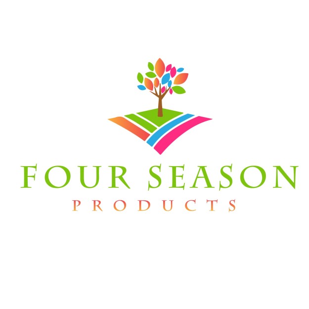
This is a logo I had produced by a chap in India for my items for sale based on the seasons.
MIXED MESSAGES
Originally, the typeface is a particular design of type, while a font is a type in a particular size and weight. In short, a typeface usually gathers many fonts. Nowadays, with the digital design of documents, you often see those two words used rather interchangeably.
Serif
Serif fonts are identifiable by the small lines on the edges of letters (called serifs) that make the font easier to read in print.
Fonts in the Serif typeface include Times New Roman, Georgia, and Book Antiqua.
Sans Serif
Sans serif font letters don’t have a serif attached to them, so they display more clearly on websites.
Fonts in the Sans serif typeface include Arial, Verdana, and Helvetica.
Here’s a diagram of the difference between Serif and Sans Serif:

Serif Fonts are Sans Serif Fonts are
- authoritative universal
- traditional modern
- respectable solid
- classic fashionable
- elegant clean
Script
Fonts in the Script typeface are meant to imitate the fluidity of human handwriting.
Fonts in the Script typeface include Comic Sans, Kristen, and Lucida.
Here’s an example of Kristen below:

Source: FontsPlace
Modern or Display
The modern typeface is characterized by variance between thin and thick bold lines in the lettering.
Fonts in the Modern typeface include Impact, Rockwell, and Agency.
Here’s an example of the Impact font:

Source: FontCo
Monospaced
Monospaced fonts have larger spaces between each letter and were designed to look like text was written using a typewriter.
Fonts in the Monospaced typeface include Courier, Consolas, and Monaco.
Here’s what Courier looks like:

Source: PrePressure
Wichita State University’s Software Usability Research Laboratory conducted a survey in 2006 to determine if different fonts had different emotions and personalities associated with them.
In the survey, they asked more than 500 participants about their perceptions of a variety of different fonts across the typefaces outlined above. The fonts that respondents answered questions about were:

Source: UsabilityNews
Different uses of each font were evaluated in the survey, such as emails, letters, spreadsheets, web pages, headlines, and news articles.
Respondents were then asked to assign personalities and emotions to each font, and the results were organized according to personality factors that the different fonts shared most frequently. The fonts within specific typefaces ended up grouping together, as you can see in the diagram below:

Source: UsabilityNews
The study then produced a detailed breakdown of the fonts most commonly associated with both positive and negative emotions and personality traits. The results are intriguing:
- Serif fonts were rated as “stable,” “practical,” and “mature.”
- Sans serif fonts didn’t receive any particularly positive or negative personality associations.
- Script fonts were perceived as “feminine,” “funny,” and “casual.”
- Modern fonts were categorized as “masculine,” “assertive,” and “coarse.”
- Monospaced fonts were called “dull,” “plain,” and “unimaginative.”
Here’s the full breakdown of the top three fonts for each emotion and personality trait in the survey:

Source: UsabilityNews
While that study provided some interesting insight around the way people view specific fonts, there are numerous other studies and theories that point to why certain fonts connote specific emotions.
For example, in a 2014 study, medical patients received the same set of at-home care instructions in different fonts, and the harder-to-read fonts made patients think the tasks were harder to do. This is an example of cognitive fluency, a theory that posits when our brains have difficulty processing information, the task at hand appear more challenging.
Similarly, a 2008 study, in which participants were presented exercise instructions in hard-to-read fonts, revealed that the challenging font choice made the task seem to require more time to achieve.
The lesson? Based on cognitive fluency, if something is easy to read, it also seems easy to do.
But that’s not all. The semantic memory associated with fonts also influences how readers feel about the fonts and the content they’re reading. For example, the Helvetica font is used on United States tax and Internal Revenue Service forms, which influences how the font is perceived — depending on their experience with the federal tax system.
All of this is to say that there are numerous theories surrounding the psychology and emotional response to different fonts. In marketing specifically, fonts can capture your audience’s attention and help reinforce your brand’s messaging, so let’s dive into some actionable takeaways for content marketers getting ready to type.
In typography, a typeface (also known as font family) is a set of characters that share common design features. A single typeface is represented by a specific weight, style, condensation, width, slant, italicization, ornamentation, and designer or foundry, but not by size.
There are thousands of different typefaces in existence, with new ones being developed constantly.
The art and craft of designing typefaces is called type design. Designers of typefaces are called type designers. In digital typography, type designers are sometimes also called font developers or font designers.
Every typeface is a collection of glyphs, each of which represents an individual letter, number, punctuation mark, or other symbol.
The term typeface is frequently confused with the term font. Before the advent of digital typography and desktop publishing, the two terms had more clearly understood meanings. – from Wikipedia
I have found a website which is called Thinking With Type and it has a page called ‘Type: A Few Good Fonts’, it gives examples of some classic fonts and a mini history about it and who designed it and in what year, also some of the influences behind it. Here they areT

 This collection gives a great variety of old ones, dating back to the 1700s John Baskerville designed Baskerville, and some newer examples are shown such as Matthew Carters Verdana in 1996.
Type is used in everything we see and do, and I found a great example of how different typeface’s are used in film. Although until now I have never taken notice of what typeface is used in film, this shows a variety of some. A whole website has been created dedicated to ‘the end’ title screen of Warner Bros films. See the website here. This particular selection is gallery of the end titles from Warner Bros. movies (1924-1967), collated by designer Christian Annyas. 
Warner Bros used the same design and typeface for many films in the beginning (1918 was their first film), as seen on the website link, but then in the 1920’s they started designing new ones to go with each individual film. This periodic table of typeface, first page of a book called Just My Type: A Book About Fonts which is a light-hearted collection of stories about fonts that is aimed at non-designers. See the feature here.

The book asks questions such as Can a font make me popular? It then goes on to show the cover of GQ magazine featuring Barak Obama and says
“Typefaces are now 560 years old. So when a Brit called Matthew Carter constructed the now-ubiquitous Verdana on his computer in the 1990s, what could he possibly be doing to an A and a B that had never been done before? And how did a friend of his make the typeface Gotham, which eased Barack Obama into the Presidency? And what exactly makes a font presidential or American, or British, French German, Swiss or Jewish?”
Here is another excellent example of some various different typefaces for the words ‘of’ and ‘the’.

https://hrcak.srce.hr/file/161817
The messages on page 117 what are they sending? I am no expert but taking them in turn and based on my own assumptions and prejudices

- ‘Enjoy your stay’
– Gothic font.
– Gives off a ‘spooky’ vibe.
– Makes statement sinister instead of genuine. - ‘DO NOT FEED THE ANIMALS THEY ARE DANGEROUS’
– All Capitals enhances the urgency of the statement.
– Font used is very sharp.
– Correlates to the message given very well.
– Could have used ‘bold’ to make it stand out a little more. - ‘We are professionals’
– A very simple font has been used.
– Style like that of a typewriter.
_ this font promotes the sense of professionalism as is stylised and simple. - ‘Luxury’
– I think this font is quite Arabic/Eygptian in feel.
– It’s simple but striking.
– It makes you think of places that are affluent and rich in history.
– I like this font and it depicts the idea of ‘luxury’ to me. - ‘hand made’
– Simple, clean font.
– lower case make it easily read.
– promotes the idea of small business instead of big corporation in keeping with the idea of ‘home made, somewhat overused now.

https://www.pinterest.co.uk/pin/421931058815070426/ (Accessed 14/09/2017)
There are several elements to this design . Not only is it advertising the Adobo Magazine, it’s advertising the brand Nike but also promoting creative ideas, like that of the student designer of the Nike tick. The typography used is a simple bold font but has a great effect when it’s been manipulated to form the shape of a Nike shoe. It shows the effect creative design has on a simple font and how it can make it unique and quirky.
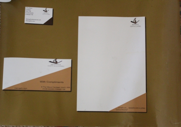
Finally I would refer you to my design book in which I completed a design brief as follows:
“Meingefn is a new bookstore in Cardigan. They are aiming to target and promote the welsh speaking community as well as having a coffee shop within the shop. They are a modern company and want to get away from the traditional bracketing of their product.”