
These are some extra items that I found whilst doing my reseach. Below is the first fully painted animated film.
Meet the Artists Behind the Oscar-Nominated ‘Loving Vincent’
Loving Vincent, the world’s first fully painted animated film directed by Dorota Kobiela and Hugh Welchman, has blazed its own artistic path — much like the artist who inspired it: Vincent van Gogh. Across the globe, the movie has secured 11 wins and over 48 nominations, including Best Animated Motion Picture at the 2018 Golden Globes, held Jan. 7, and Best Animated Feature Film at this year’s Academy Awards, held March 4 in Los Angeles.
“The reason we made the film is not because we want to be the first, or that we want to set any records, it is because we believe that you cannot truly tell Vincent’s story without his paintings,” reports the film’s official website, LovingVincent.com. “So we needed to bring his paintings to life.”
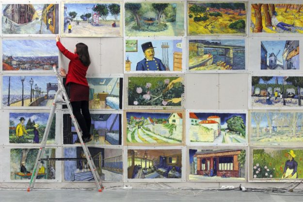
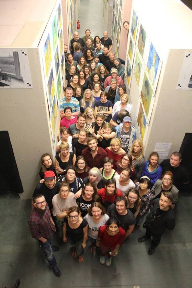
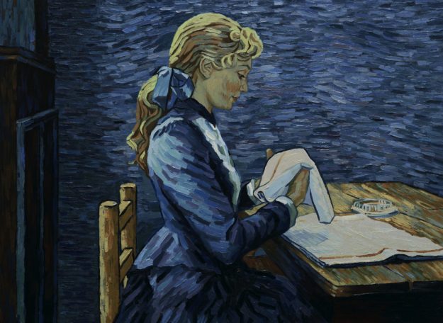
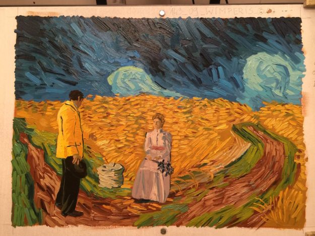
The film was first shot with live actors, starring Robert Gulaczyk as van Gogh, then converted into oil paintings frame by frame. Taking six years and an estimated $5 million to create, 125 artists painted more than 65,000 frames in oil — all in van Gogh’s signature style, of course.
“It was the most amazing experience,” recalls Sarah Wimperis, one of the artists who worked on the movie. “Like a boot camp for artists, at times it was brutal, very tough getting through the training. [There were] long hours, and [it was] very difficult to shed your own artistic style. Everyone was far from home and families. But it was also brilliant [and] a fantastic project to be involved in.”
Behind the Process
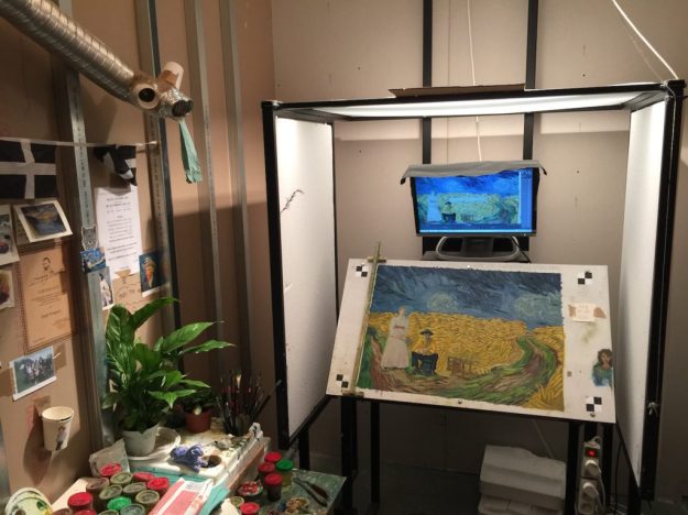
The troupe of artists worked out of studios in Gdansk and Wroclaw, Poland, and another in Athens, Greece, for the duration of the project. They were assigned to small lightproof cubicles called lighting PAWS (Painting, Animation Work Stations) lit with halogen lamps to ensure consistent lighting when snapping pictures of the finished frames.
The actors were filmed on a green screen with minimal props, explains Wimperis, and transformed into a sort of line drawing. Frame by frame, a shot would project onto an artist’s board to act as a guide to capture the actor’s movement.
“The picture would then be created combining the van Gogh painting (that was the ‘set’ for the action of your shot) with the actors,” notes Wimperis. “The actors had to be painted in the van Gogh style but still [maintain] their own looks, like a portrait.”
This presented a challenging task for the artists. “You would get the first frame painted, find and mix all the colors by eye, mixing enough color to last for the whole shot, some as long as 300 frames,” continues Wimperis, adding that the process could take anywhere from one to five days, depending on the shot’s complexity.
Once the frame in the shot received the “all clear,” the animation could begin — which, the artist notes, meant scraping off the painting, cleaning it back up and replacing the brushstrokes one by one in a slightly different position. Then, the cycle repeats by moving on to photograph the second frame. Following this process, Wimperis averaged about four frames per day.
With such an extensive method to complete just one frame, Wimperis says the number of frames she worked on for Loving Vincent is etched on her heart. “I painted 384 frames for the film over a period of five months,” she exclaims. “At 12 frames per second, I painted a grand total of 32 seconds of the film!”
To some, 32 seconds of a roughly 94-minute film may not seem like a worthwhile feat after tirelessly working for five months far away from friends and family. However, to Wimperis, working on a project involving one of the most famous artists in history was a once-in-a-lifetime opportunity.
“[Van Gogh] is one of my favorite artists; he always has been,” shares Wimperis. “But I love him more now because I feel that I have a special connection after spending so long in the company of his brushstrokes.”
Being Selected
In addition to copying the brushstrokes of a master artist, attending the premier is another epic perk of the job. Wimperis — along with other artists who worked on the film — was able to attend the U.K. premiere of Loving Vincent held at the National Gallery in London.
“I was also on the Q&A panel after the film, so I missed the ending [since] I had to be backstage,” she recalls. “However, I have seen it quite a few times now. It’s so lovely to see it finished. And the music is wonderful. I am just very proud to be a part of such a great project.”
So how does one get selected to take part in such a prestigious project? “I saw the recruitment trailer on Facebook. It went viral with over 200 million views,” says Wimperis. “They were asking for interest from artists who painted in oil color so I sent them samples of my work, as did 5,000 other artists from all around the world.”
After not hearing anything back, Wimperis nearly forgot all about the opportunity. But, several months later, she received an email from the movie’s production team requesting a Skype conversation. During the chat, she was asked if she would be interested in coming out to Gdansk for a three-day testing period.
“Of course I was,” she asserts. “A couple of days later I was on a flight to Gdansk. They tested about 90 artists from everywhere: U.S., Canada, Mexico, Australia — all over the world. It was [a] hard three days of learning the very basics of animation with oil paint. Then we all went home with no idea of how we had done.”
About a week later, 30 artists including Wimperis were invited back to Gdansk for a three-week training session. “I was doing an art fair with my assistant when I got the call. So we packed up our stand, drove to a supermarket and I [bought] a suitcase to put my weekend’s worth of art fair clothes in,” remembers Wimperis.
Her assistant dropped her off at the airport. They said their goodbyes for what they thought was a three-week trip to Poland. “How naive was I,” she recollects. “I didn’t see him or home again for five months.”
The film company put the artists up in hostels for the first three weeks of training. “But after that,” notes Wimperis, “we were on our own, which was exciting.”
Lasting Impressions
Although the three-week training turned into a five-month contract to work on Loving Vincent, Wimperis says she would do it all over again. “I would work on a film about another artist. [However], I would have to like their work,” she explains. “The animation process hasn’t influenced my work at all. But I think van Gogh might have.”
She continues, “What [painting like van Gogh] has done is convince me of the benefits for all artists, whatever stage you are at, beginner or professional, of studying and copying work of artists [who] you are drawn to. It’s a fantastic way to learn and to practice your skills.”
If appreciators of van Gogh and the film alike want to keep one as a cherished keepsake, approximately 200 of the final oil paintings are up for sale on the movie’s website. One of Wimperis’ paintings featured in Loving Vincent has already sold to a collector of her work. “He rang me and told me,” she says. “I will get to see it when he has had it framed. I am going to sign the back [of the painting] for him.”
And, if you are excited to try your hand at painting like Vincent van Gogh, seize the opportunity with Impressionist Painting with George Gallo Deluxe Collection. You’ll create art that reflects the style and substance of the greatest painters of all time.
Still haven’t seen Loving Vincent? Watch the trailer below.
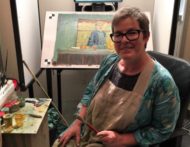
In Her Words: Meet Artist Sarah Wimperis
I received a degree in sculpture, during which I wanted to use the time to learn skills like casting and welding. I also wanted to keep my painting a bit secret. That was a long time ago.
Since then I have traveled to paint, taught in Norway for six years, and completed a fair bit of illustration work. I used to be an illustrator for the show “Jackanory” on the BBC.
I have been very lucky to have a supportive partner who took on a lot of the childcare and household stuff when our five kids were small. They are all grown and have kids of their own now, but he still does a lot of the day-to-day tasks, which gives me time to paint.
I run workshops as well, using van Gogh as inspiration. I still sculpt a bit and recently have gotten interested in making small rooms based on famous paintings. Of course, it was van Gogh’s bedroom at Arles that set that interest off!
Model of Vincent’s bedroom; photo courtesy of Sarah Wimperis
You can learn more about Wimperis and her art by visiting her website, www.sarahwimperis.co.uk.
I found this amazing museum after watching BBC 2’s Civilization.
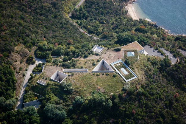
Chichu Art Museum
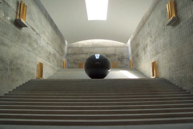
Chichu Art Museum was constructed in 2004 as a site rethinking the relationship between nature and people. The museum was built mostly underground to avoid affecting the beautiful natural scenery of the Seto Inland sea. Artworks by Claude Monet, James Turrell, and Walter De Maria are on permanent display in this building designed by Tadao Ando. Despite being primarily subterranean, the museum lets in an abundance of natural light that changes the appearance of the artworks and the ambience of the space itself with the passage of time, throughout the day and all along the four seasons of the year.
Taking form as the artists and architect bounced ideas off each other, the museum in its entirety can be seen as a very large site-specific artwork.
http://benesse-artsite.jp/en/art/chichu.html
Architect Tadao Ando
Using solely concrete – the main material employed in Ando’s architecture – steel, glass and wood, the design of the Chichu Art Museum is reduced to the very minimum. Built almost entirely underground, the museum balances the contradictory qualities of being both non-monumental but highly architectural.
Born in 1935 in Albany, California. Studied history and obtained a master’s degree in art at the University of California, Berkeley from 1953 to 1959. Died in 2013 (at age 77).
Significant Works: The Lightning Field (1977, New Mexico), The New York Earth Room (1977, New York), The Broken Kilometer (1979, New York), Seen/Unseen Known/Unknown (2000, Naoshima).
The same programme led me to these paintings which seemed appropriate to the theme of place and time. It was also work that was new to me.
- Time/Timeless/No Time ,
- 2004
|
   |
In the evolution of Mondrian’s art, this small work, painted on cardboard in a loose pointillist technique, clearly belongs with the preceding works of 1908, such as Windmill in Sunlight.
In this little sketch, the accent is on entirely different aspects of the pictorial possibilities. Color has by now taken its place of importance in Mondrian’s work, and he is no longer concerned with the clearcut contrast of a thing with its surroundings; on the contrary, the divisionist technique enables him to fuse things with their surroundings into a large and convincing unity. And this is what one sees happening in this little picture. The soaring mass of the tower merges with the upward movement of the color of the sky, producing a consonant, vibrating totality of great purity and power.
This year of 1909, in which Mondrian gave such evident proof that he was in the center of the movement for the renewal of painting in Europe, began with a joint exhibition in the Amsterdam Stedelijk Museum of the most recent work of Cornells Spoor, Jan Sluijters, and Mondrian. At that time Jan Sluijters was the leader of the Dutch avant-garde.
Like another Dutch artist Van Gogh, Piet Mondrian is among the foremost leaders of the Dutch avant-garde during his life time. His use of color, his stippling technique, the way in which he could evoke the unity of nature by means of his vivid color, secured him his place. But for Mondrian, as for many a French painter of the same generation, fauvism proved to be a way station on the road to a new style for the future.


In Dune V, too, we can trace the change in theme back to an earlier period, probably as far as the year of Mondrian’s first visit to Zeeland in 1908. In all probability that year is the date of a drawing, one of a series, with a view of the dunes and the sea, although the theme is not so precisely conceived as in the painting reproduced here. The motif of this canvas has a marked similarity to Dune II, the pointillist painting of 1909, which in turn is aligned with the pointillist version of the Lighthouse at Westkapelle. In Dune II there occur the same slope and the same undulating foreground that are worked out so characteristically in Dune V. And in both pictures the composition, with its typical asymmetry, accentuates the similarity.
Both Dune II and Dune V quite clearly expresses the feeling that the infinitude of nature and the grandeur of Creation are most adequately rendered by the simplest of forms and colors. The esoteric content of these paintings, their expression of a cosmic world view, is in evident concordance with the theosophical insights and meditations that preoccupied Mondrian during these years.
In June 1914 an exhibition of Mondrian’s work was opened in The Hague, at the Walrecht Gallery. A few weeks later the artist was called back to the Netherlands from Paris, to the sickbed of his father. Then World War I broke out, making it impossible for him to return to France, although he insisted that he wanted to go. In the end, his family and friends were able to persuade him that any such attempt was useless. And so Mondrian was confined to the Netherlands for the duration of the war, cut off from the ambience of Paris which had inspired most of his work over the last few years.
He soon returned to the themes he had been concerned with in Zealand and elsewhere before moving to Paris. He did a series of drawings of the church at Domburg, conceived in accordance with the “abstract cubism” that he had developed in Paris. But in addition to this old theme he took up two particular new motifs, which were to occupy him for the first years of his enforced residence in the Netherlands: the sea, a subject that he had already handled in several works during his Zeeland period; and something related yet completely new – the theme of Pier and Ocean.
This title is perhaps too simple for the powerful series of paintings and drawings to which it is applied. What these works are actually about is the rhythm of the waves, breaking in a strictly circumscribed cadence against the structure built out at a right angle into the sea. As can be seen, the view is from above, for Mondrian first sketched the subject looking down from the dunes. In the first drawings, in charcoal, sometimes heightened with India ink or tempera, the pier is still clearly recognizable.
Composition No. 10: Pier and Ocean epitomizes all the previous stages of this composition. It straightens all the elements that in earlier versions were indicated by oblique or indistinct lines. It reduces the rhythm of the waves and their breaking to a pure and simple pattern of lines, each precisely determinate in length and interval, like notes in a musical score. And yet this painting is remarkable precisely for the reason that this rhythmic abstraction from the unending movement of nature still proceeds visibly and demonstrably from an optical perception, even though it has been translated into an idiom in which only the rhythmic values count and all memory of the original subject matter has been lost.
As Simon Sharma put it in BBC 2 Civilisation Abstract vision, great boundless grace, symplified and magnified.
GALLERY VISITS
My husband and I visited this exhibition and spoke to the artists on a shopping trip in Cardigan. It was interesting to hear that Debbie Dunbar will paint from photgraphs as often the horse in question has died but that it was based on years of experience of painting from life.

The Corn Exchange Gallery
The Corn Exchange art and craft gallery is situated in the centre of Cardigan. Exhibitions of local creativity change weekly from March to December. The space combines the architectural heritage of this Ruskinian Gothic building, with modern space and light.
Debbie Dunbar & Valerie Price West
Monday 23 Apr 2018 – Saturday 28 Apr 2018

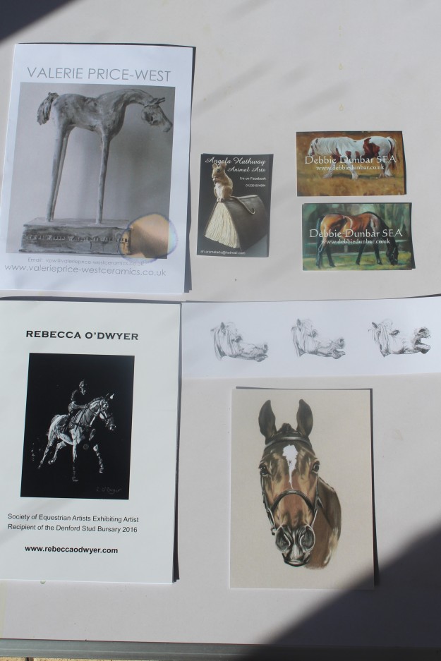
DEBBIE DUNBAR

“I like to work from life as much as possible, and I am currently mentored by the renowned Equestrian and Countryside artist Malcolm Coward HSEA. I have been a member of the SEA for some years and became a Full Member in 2015. I was their Honorary Secretary and Webmaster for six years and am currently still an active Trustee. I was shocked and honoured to receive the Cuneo Medal in 2017 which is the highest award the Society bestows – voted for by the Full Members of the Society at the Horse in Art Exhibition which takes place at Sally Mitchell’s Gallery in Tuxford. In 2012 I was also honoured to be awarded the John Noott Gallery prize for Best Oil Painting at the Annual Exhibition for the painting “Parthenon”
Living and working as a professional artist in West Wales since 1986, and originally comes from Rugby, Warwickshire. Her vibrant equestrian work is collected internationally she exhibits in several joint and solo exhibitions around the country each year. Specializing in equine art but domestic livestock, people and rural art also feature. As a qualified tutor she teaches part time and runs one day workshops in the summer. Debbie is very happy to discuss commissioned work, please see her website for moreinformation or email her direct. debbie@edebbiedunbar.co.uk
EXPERIENCE of PART 3
I have enjoyed this part of the course, partly because it visits some of the ideas and information I have explored before. It covers a very broad spectrum of ideas and messages. You can look at the history, the process and the result.
“Nor can an assertion of the importance of art -whether as a painting, avant – garde film or video- escape the cultural framework.” “…Culture was also used as in a different sense as being the entire social network of a particular society.” An Introduction to Visual Culture Nicholas Mirzoeff.
One thing I’ve learnt is there are very few original ideas in new media, most have been re-appropriated, modernized, or inspired by bygone designs. We must constantly look to the past in order to move forward. There is so much design inspiration, it can be overwhelming.
I had a look at the journals and websites list at the end of this chapter, the design websites were interesting but it made it quite clear to me that graphic design is not something I enjoy, I spent 3 months studying graphic design last year at St Davids . I enjoy the concepts and am amazed at the results and techniques but do not enjoy the process myself. This is probably due to the fact that I do not enjoy working with computers, I find sitting at a computer tedious, I spent 30 years working with them. That said I love what they can do and enjoy my toys, such as Alexa.
I found the book on semiotics fascinating and it linked in with the novel I was reading at the time Dan Brown Symbols which covered much the same ground in a lighthearted way. It made me think about the way we use words and think, the same could be said for the typography which linked into the graphic design again.
The research into collage was fascinating and I liked Martha Rosler’s work, I found it difficult however to choose a subject and was torn between various stories. I finally choose Martin Luther King as he came from my time. The result was not as good as I had hoped neither was it as bad as I feared! If I had continued with it I would have liked to have done it on a bigger scale and shown film through the gap.
I really enjoyed the poster exercise my husband and I had good fun researching this, and as he is 78, I was able to talk to him about some of the original meanings. The same could be said for re-using the old.
The knitting exercise when I first read it filled me with dread as I do not enjoy knitting, in the end I found the process of the exercise with the mind mapping most helpful but I still do not take to knitting!
The time and place section was the most intellectually challenging for me, I did finally finish reading Marshall McLuhan (the global village), I found it very difficult to read and had to use every trick in my repertoire to finish it. That said having finished it, the concepts do now come to mind as I look at other areas in the course. The cutting edge was informative, though I do not like Facebook etc and avoid them like the plague, as I find them intrusive and unhelpful to good communication.
The re- appropriated image was my favourite part as I enjoyed the research and the connections that were made. I found it helpful too in my own work how to appropriate images.
This part has reconfirmed that it is the research and intellectual rigour that I relish (though not always successfully) and the building and expanding my knowledge base.
“The medium is the message” is a phrase by Marshall McLuhan meaning that the form of a medium embeds itself in any message it would transmit or convey, creating a symbiotic relationship by which the medium influences how the message is perceived.
Visual communication is a broad subject which to me also means visual culture, the relationship between things,space, and everyday practices. The shaping of the world view, the framework of ideas and beliefs, everything that is seen, produced to be seen and the understanding of what is seen.
This part was, for me, a means to developing my understanding of the ways in which images and artefactscan be analysed in relation to thier cultural,social and historical understanding.
REFLECTION on FEEDBACK
Michele’s comments on Part 2 where intuitive and constructive and I have certainly reflected and attempted to change some of my habits for the better I hope.
As she says I really struggled with this one, I found The Road a very difficult book to comment on. I took the time to read How To Write Art History by Anne D’Alleva which has helped and am trying to structure my responses to be more appropriate. I will confess I find the lack of someone to bounce off difficult as so much of my career was working with very bright people who were always happy to listen and advice. Being very isolated helps in some way but not in others.
I have gone back and tried to improve the three areas identified by my tutor:
Project 3 Ways of Saying and Seeing.
Project 4 The Road
Assignment
Fuller account of meeting and introduction.
I hope we will be able to talk briefly so that I can clarify some points I feel I may not have grasped.
- Could you consider types of print for a visual collation of images maybe?
- Online references as I often find one on Wikipedia, think I should find another source ie The Tate only to find it also comes from Wikipedia. Help please! I have read the manual but feel a brief chat may sink in better – re secondary/primary .
- Cut/paste with blog as it looks one way my end but seems to look different your end am I doing something wrong. I will confess the hardest part of the course for me is the Blog as an ex civil servant.
Thank you for the assistance and I look forward to Part 4 Photography which I feel will this time match up very well with Practise of Painting Landscapes.
